African typography is inevitably linked in the minds of many to tribal imagery, rough lettering, and loosely geometrical features. Designers wishing to convey an African sensibility in their work through typography are often left with stereotypical choices. A search with the keyword “African” on Typekit or Font Squirrel does not yield any results. Further queries on Fonts.com and Linotype yield these choices: African Elephant Trunk, Lagos Regular, Afroflare Regular, and simply “African.” This latter font family, designed by Anton Scholtz, is by far the most popular hit as it is also present in Google fonts. The font families are predictably called African Gold, African Jungle and African Textile. Needless to say that there is a glaring gap of elegant African-inspired fonts.
So what exactly qualifies as an African font? Is such a designation necessary or even desirable? With such a vibrant culture, Africa is teeming with opportunities for designers to get inspired and bring a fresh new look to a field that can be prone to dogmatism as to what constitutes good typography. Below are some designers aiming to showcase the cultural heritage of the continent and bringing it into the digital age.
First, there’s Osmond Tshuma, who has developed a historically-inspired font with a focus on the legacy of the West. According to his commentary, “The Colonial Bastard Rhodes typeface is a post-colonial critique of both Cecil John Rhodes and the impact of Colonialism in South Africa.” Arguably this font can be called African although it does not reference the indigenous culture. The origin and process have been adapted to voice a message and a unique point of view, which encourages dialogue. Also, the typeface is rigorously designed and shows a great amount of skill and refinement.

Osmond hard at work on The Colonial Bastard Rhodes typeface.
Senongo Akpem shows the same level of thought and care but pushes his type exploration in a more whimsical direction. He uses collage techniques to give a festive flair to his creation. The visual reference to African textiles and their flamboyant colors is clearly present, however it is much less literal than the previously mentioned “African Textile” font family by Scholtz. (Read our interview with Akpem here.)

Senongo Akpem’s Mixel Typography
Studio Muti is part of the wave of illustrators and letterers that has put the South African design industry on the map. Their approach to typography relies heavily on the visual language of hand-lettered signs that are staples of small shops all across the continent. The scripts are bold, the colors are loud, and even though there is a roughness inherent in the process, it is miles away from being crude.

Studio Muti – Pressure Makes Diamonds
Johnny Kotze’s work is characterized by a fun, deceptively carefree attitude that really communicates the culture to which he belongs. There is something unmistakable about where the exuberance and boldness of his letters in his works get their influence.

Johnny Kotze for Virgin Mobile
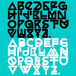
Finally, Kevin Karanja is a young Kenyan designer who has crafted a typeface named Charvet. His approach was also based on historical and cultural research into traditional patterns and symbols. The result is a slab serif typeface with repeating geometric elements, which echoes the past but within a formalized and refined aesthetic. Remarkably, the font is available to download free of charge, which has contributed to its widespread use in projects all across the Internet. (Listen to Kevin Karanja’s interview with us here.)

Charvet by Kevin Karanja
The work of these designers reflect an attitude that is gaining momentum; cultural heritage that has been appropriated and misinterpreted for so long can and should be reclaimed to showcase all that is possible when minds are seeking after truth and beauty. The door lies wide open and the challenge is out for black designers especially to rewrite the typographic history of Africa, and take it into a bright new future.